Article by: Mitchell Parker, Houzz
Kitchen seating seems simple enough. Scoot in a few bar stools around an island or a peninsula and you’re done. But when you’re trying to create something flexible for small and large gatherings, accommodate a view or make the most of a compact layout, it’s time for something a little more outside the box. Here, two designers explain how they rethought mealtime in the kitchen.
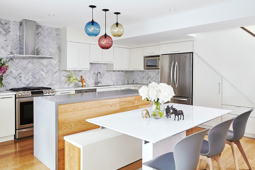
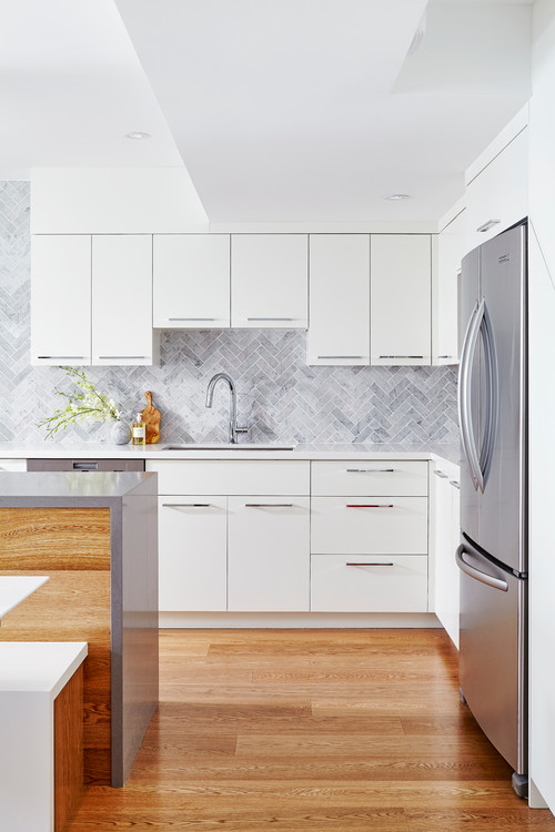
1. Compact Combo
Designer: Dianne Berman of Delo Interiors
Location: Toronto
Size: 320 square feet (about 30 square meters)
Year built: 1975; was renovated in the early ’90s, and this recent update was completed in 2015
Kitchen seating: Given the small footprint and square shape, designer Dianne Berman knew she had to make every inch count. By grouping the dining space with a large island and connecting the bench seating to it, she created one path of travel around the entire kitchen rather than two. “This layout also created a more intimate feel,” Berman says. “The homeowners can cook and prep while family and friends gather around the table, bar area or island. Everyone faces toward the center of the space, which makes conversations flow.”
Homeowners’ request: Clean lines, minimal ornamentation and a calm color palette. Functionally, they wanted space to entertain small and large groups of friends and family. The entrance to the home opens to this space, so storage for coats, boots and shoes was a must. Berman integrated built-in cabinets and drawers beneath the stairway.
Why the design works: To make the kitchen feel larger, Berman carried the backsplash to the ceiling. She also kept space open on either side of the vent hood so the area by the cabinets didn’t look crowded. The waterfall-edge countertop on the island adds to the clean lines requested by the homeowner.
What wasn’t working: The previous kitchen had a dropped 7-foot ceiling over a peninsula, an out-of-commission wood-burning fireplace and a dining table that felt like an afterthought. Berman removed all these hindrances to open things up. She then added recessed LED lights, undercabinet lighting and decorative drop pendants to further push the openness.
What goes on here: Intimate meals, large parties for family and friends, and quick breakfasts while watching the morning news. In the summer months, the family opens double French doors to extend the space to the patio.
Who uses it: A health system researcher and a product development chemist.
Designer secret: “Storage is always key in urban environments,” Berman says. “We added a ton of concealed storage to keep all belongings tucked away and out of sight.”
Splurges and savings: The homeowners splurged on the three colored hand-blown Italian light fixtures over the island while saving on pendant lights from West Elm for a nearby bar area.
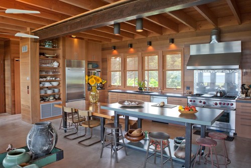
2. Airy and Adjustable
Architect and designer: Jill Neubauer
Location: Oak Bluffs, Martha’s Vineyard, Massachusetts
Size: 264 square feet (24.5 square meters); about 12 by 22 feet (3.6 by 6.7 meters)
Year built: 2008
Kitchen seating: Two tables at varying heights offer traditional sit-down dining or more casual bar-height dining. The lower table can be wheeled out to combine with a second, identical table to create room for dinner parties of 20 people, while the higher table works as extra prep space.
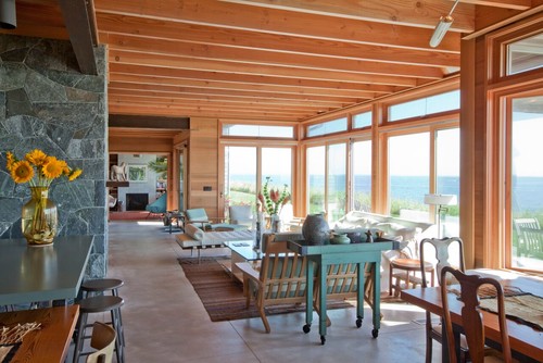
Homeowners’ request: A large, open, social and hardworking kitchen that has full views of Martha’s Sound off Martha’s Vineyard in Massachusetts.
Plan of attack: Making the most of a narrow house, designer Jill Neubauer placed the main elements of the large, open kitchen along the street-facing side of the home to open the space to the ocean on the opposite side.
Vertical-grain Douglas fir cabinets and one portion of the island (on the left) warm the concrete floors and countertops. Stained plywood tops the island on the right — “warm, easy, beautiful, soft, quiet, forgiving, inexpensive,” Neubauer says of the material. Open shelves make work easier in the busy kitchen, and allow guests to be more helpful too because they can see where things are.
Who uses it: This is a summer house for a family.
Designer secret: “Walk the line of richness and clarity,” Neubauer says. It also helps to have clients with style. “The owner had magnificent, cool furniture,” she says. “It brought the house to an entirely new level of aesthetics and pulled it all together with warmth and memories.”
“Uh-oh” moment: Neubauer’s challenge was to make a modern, raw, industrial house in a historic district — “without making the house look like a box with cool stuff dropped inside,” she says. Communication and collaboration helped push the project over the hurdles.
Splurges and savings: Neubauer and the homeowners saved by not striving for perfection. Cedar walls were installed in a simple fashion, with dings and bulging boards welcomed. “This gave a feeling of softness and livability, not perfection,” the designer says.
Take-away: “Combining raw material — warm, soft wood with hard cool concrete — is a success. It’s all about balance,” Neubauer says. Also, “all construction is costly.”