FREE DESIGNS AND ESTIMATES

Get More From Your Kitchen Island

Article by:

Many kitchen islands open directly into another room. If you don’t require seating on that other side of your island, it’s a great opportunity to make the island serve purposes other than cooking and eating. When planning for an island, consider how it can be used to your advantage, whether it’s incorporating additional display space, extra storage or even strategically separating — or connecting — other spaces. Here’s how you can make your island work harder for you.

Get More Display and Storage

These open shelves wrap around the island to create display space on two sides. This makes for a much more eye-catching addition in an open floor plan. Can you imagine staring at solid planes of material here? Meanwhile, a small countertop at the opposite end still accommodates some island seating. 

Although this island also has shelves below, the real eye catcher is the ceiling-hung shelves, which create a bright, casual cookware display. What a visual feast for diners! 

Where seating is not required, think about incorporating bookshelves along the length of your island — perfect for all those cookbooks. 

Full-height cabinets block kitchen messes, provide storage and hold a TV here. 

Get a Divider or Transition

A simple, narrow dividing wall, which seemingly arises from the island, partially hides the cooking area and creates a stunning art wall. Notice how the sculpture niche is finished to match the cabinetry, creating the transition from kitchen to the living-dining area. 

This island does double duty with a working kitchen side and a buffet dining side, but it doesn’t stop there: The beautifully detailed end wall hides any mess and creates a lovely focal point. 

In this very open space, the island ends in a fabulous display area that looks like furniture. This concept blurs the line between cooking and living areas. 

Want to hide your dirty dishes but still converse with the guests? Use meticulously detailed cabinetry as a horizontal backdrop to your dining area — much more interesting than drywall. A narrow continuation of the countertop even serves as a buffet space. 

In the same space seen from the kitchen side, small cabinets actually form the top of the dining “wall” and provide storage — bonus! 

Get Table Seating

In this kitchen a working island is paired with a built-in banquette, making an attractive, handy spot for dining. This would work equally well with a rectangular island. 

Ease a Level Change

Many homes have a step or two from the kitchen to a living area, typically with a railing of some sort. Why not create a casual dining area as a buffer between the two instead, utilizing some great cabinetry?

What to Consider With an Extra-Long Kitchen Island

Article by: Eric Reinholdt

Unlike its isolated geographic cousin in an ocean, an island in the kitchen serves as a central gathering space. As our kitchens have become more and more connected to our living spaces, they’ve changed from being solely utilitarian to being social gathering hubs. The island is often a central player in having a whole host of functions now, and the longer it is, the more function you can pack into it. 

Typical kitchen islands range between 7 and 10 feet; the long islands in this ideabook begin at 12 feet. The long island has definite advantages; however, it’s not without a few special planning challenges. Let’s review what you’ll need to know to chart the course to your own long island.

Flexibility

The more our homes can accommodate the many functions of everyday life, the better the chance they’ll meet our long-term needs, because needs invariably change over time. Long islands serve this idea well by acting as flexible workstations. Today’s kitchens must accommodate serving, cooking, seating, gathering, display and even work tasks. 

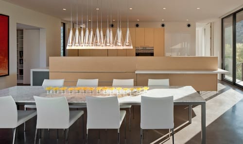
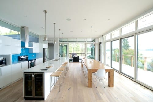
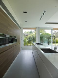
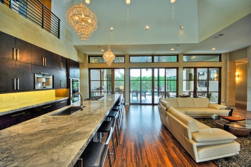
The underlying design idea for the modern extension seen here was deference to the landscape. The interior spaces are arranged to orient the occupants’ focus toward the exterior. This was done, in part, by minimizing interior obstructions to this view. And this long island seamlessly complements that vision. Its length accommodates gathering, storage and much of the function of the kitchen in one single move. 

The architects have carried the clean, minimalist aesthetic to every last detail, taking care to recess even the faucet controls. By stripping this long object of any visual ornamentation, they’ve left multiple functions open to interpretation and whim.

Focus

One undeniable advantage of the long island is that it allows for a change in the traditional orientation of kitchen tasks. It does this by creating a workspace large enough to allow for all of the kitchen work — preparation, cooking and cleanup — to occur in and around the island, allowing the cooks to face their guests and family gathered in the kitchen.

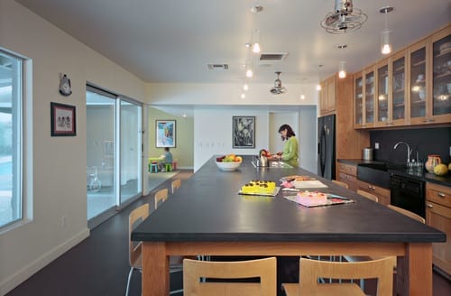
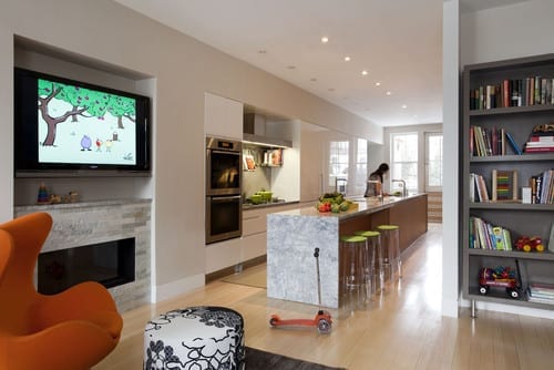
This island’s design lends a laboratory vibe to the space. It’s freestanding and furniture-like, permitting dining for the entire family at one end, open and closed storage at the opposite end, and preparation, cooking and serving in between. It’s also proof that even a large island can feel light and open. Being proportional to the space is key here, and I love how this one functions as a communal worktable.

Function

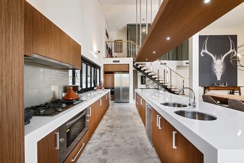
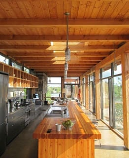
The longer the island, the more roles it can play. In this kitchen the island is the clear focal point, and it houses much of its functional components. By extending the island, the architects were able to incorporate storage, a sink and multiple cooking appliances. By building in the long bank of storage, they eliminated the need for upper cabinetry; paired with the skylight above, this reinforces the open, loft-like feel of the space.

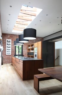
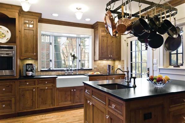
Long islands naturally come with broad expanses of counter space, something every kitchen can benefit from. Meeting both cooking and cleanup needs and dressed in hand-hewn walnut, this island was designed as a piece of bespoke furniture that measures 42 inches wide and 146 inches long.

Spatial Definition

Often our kitchens are cluttered with what we need to actually cook in the kitchen. While we’re eating, most of us aren’t interested in staring at the cooking mess we’ve left behind. 

Many modern spaces are interconnected and feel larger because of that openness. Walling off the kitchen to hide the clutter is not only impractical but unnecessarily confining. The architects here solved that by elongating the island to almost the entire width of the room and elevating the backsplash. 

Treating the island the same way as the wall of cabinetry at the rear of the kitchen clearly defines the kitchen as its own space, but still enables the cooks to be a part of the activity of the larger space. The backsplash here also functions as an appliance garage, with lift-up doors that conceal the appliances.

The thick divider can serve both sides of the kitchen. Facing the kitchen side above the counter and facing the dining area below the counter, it can function as storage cabinetry.

Spatial definition has been punctuated above this long island by an overhead plane clad in wood sized to match the island dimensions. This doubles as a place to locate task lighting for the counter.

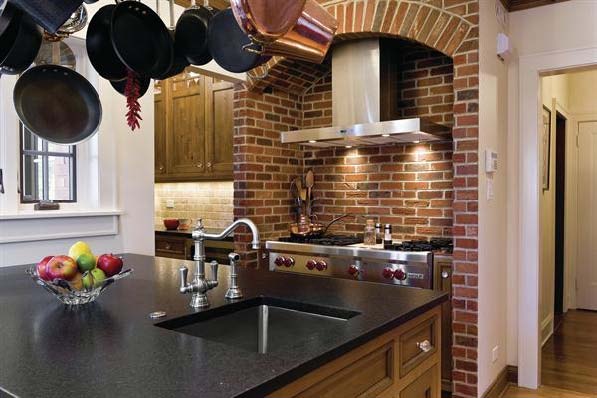
Positioning the cleanup area of the kitchen closest to the dining space creates an efficient layout. And, while locating the sink across from the cooking zone in such a long kitchen may seem counterintuitive, it makes good design sense; it frees up more counter space. Because the cleanup area will be used after the cooking, placing these zones back to back isn’t the problem it may seem at first.

Seating and Dining

A popular choice for many islands is integrated seating. With a long island, the seating area can accommodate the entire family alongside guests. Diner-like in its configuration, this island comfortably seats eight or nine guests.

A good standard for counter seating is 2 linear feet per person. This will prevent elbow conflicts and be comfortable for most people. In smaller kitchens or spaces where a dining room isn’t possible, the long island can fill the role of a dining table. Here again this island’s proportion mirrors the proportion of the space.

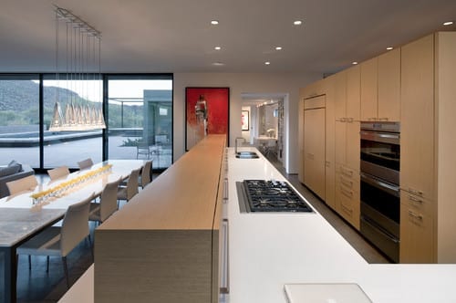
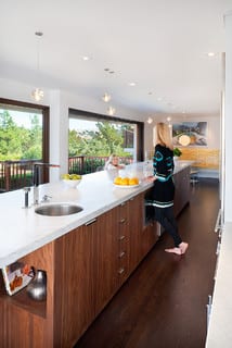
Note the undercounter refrigerator at the end. This clever arrangement allows people to access beverages without having to cross into the kitchen and disrupt cooking tasks there. Long islands permit this kind of thoughtful kitchen zoning.

Clearances

It’s important that your kitchen island fit comfortably within the confines of your kitchen, and clearances are an essential consideration. A basic rule of thumb is to provide a minimum of 42 inches of working space around the island, even if you’ll be including seating. 

It is possible to push these recommended minimums. In this example the architects reduced the working space to 36 inches surrounding the island, maintaining a functional balance, given the narrow footprint of the row house.

Cabinetry and seating depths are also part of the size equation. Typical base cabinets are 24 inches deep; seating areas can be as shallow as 12 inches but are more comfortable at 18 inches. So for a two-sided island with seating, a minimum comfortable dimension would be 42 inches deep.

Materials

Choosing to match or contrast the island to the materials of the room is a critical decision. Choosing a fine hardwood will make it more furniture-like. Matching the surrounding cabinetry will clearly say it’s a part of the kitchen, while choosing an altogether different material will make it more of a table and something clearly distinct.

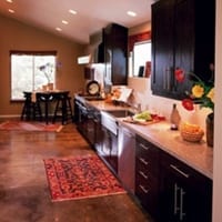
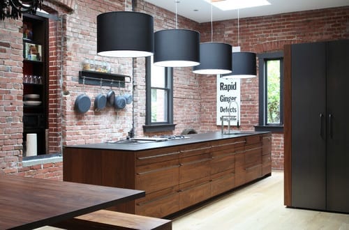
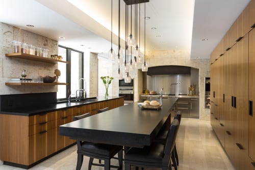
The island here contrasts the cabinetry but draws on a similar tonal palette. The black counter and hardware accents along with the pendant fixture tie this composition together without relying on one single material. It’s a more complex dialogue that adds richness to the kitchen. This island is 16 feet long with 40 inches of clearance around it and an amazing cantilevered seating area measuring 78 by 40 inches.

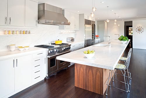
Just because they’re massive doesn’t mean long islands have to dominate a space. The focal point in this kitchen is the natural wood facing on the wall of cabinetry at the rear. 

In a walled kitchen such as this, a long island can be an obvious complementary design device. The cooking and storage wall requires counter space nearby, and the long island fits the bill with a horizontal surface for every inch of wall cabinet. Here again, note the cooking and cleanup zones.

Special Considerations

The benefits of a long island don’t come without a few pitfalls. Pay particular attention to:

Traffic Flow

Long islands mean long travel distances to get to the other side. It’s important to consider this when settling on an overall length and to understand how the circulation or flow of traffic will work. 

Storing items that need frequent loading and unloading from a dishwasher on the other side of an 18-foot island will mean lots of traveling back and forth. Establishing clear zones within the island is one way of mitigating this. So too is limiting the width of the island. This will mean loading the functional components of the kitchen on the kitchen side and keeping the seating areas on the opposite side or end.

Linear spaces pair well with long island configurations. Two obvious patterns of circulation exist here, and because of the narrow room dimension, the entire kitchen feels a part of the outdoors. This long island is the central spine of activity; with different functions pinwheeling off of it, it’s hard to tell where the kitchen ends and the living begins. In this way the long island becomes the Swiss Army knife of architectural space makers, humbly serving a multitude of functions.

Counter Seams

If your island extends beyond the typical 7 to 8 feet in length, you’ll face a more limited selection of seamless countertop materials. This island is 42 inches wide and 20 feet long. At these extreme dimensions, the architect certainly had to contend with seams.

Natural stone can be the most limiting material choice for long countertops, with the selection of slabs trailing off quickly when you reach 8 feet or longer. Manufactured surfaces (Corian, Richlite, Caesarstone etc.) can be had up to 10 feet in length and close to 5 feet in width. If it’s wood or stainless steel you’re after, your options are greater.

Seams aren’t as bad as you might think, though, as long you plan for them. This counter is 15 feet long and 4 feet wide, with a mitered edge giving it the appearance of a 4-inch-thick slab. See if you can identify the seams (there are two). 

Natural stone slabs can be book matched so the natural veining meets up at the seam, or a more even-toned slab can be selected to minimize the appearance of the seaming. It’s also possible to simply acknowledge that a seam exists, which highlights that it’s a natural material limited by industrial extraction and handling limitations. 

Manufactured counter surfaces can be welded together and are typically more uniformly colored, allowing seams to virtually disappear.

Kitchen Design: How to Avoid Standing Room Only

Photo Credit: Dennis Jourdan Photography via Remodeling Magazine

Room for Two: Alder cabinets, honed granite countertops and a tumbled marble backsplash give this kitchen a rustic feel.

The homeowners of this 1920s house (pictured above) had been planning a kitchen remodel for a long time. They went so far as to work on a design that would enclose the porch to expand the space, then got cold feet during the market downturn, and, worrying about the return on investment for an addition, put the project on hold.

By the time designer Diane Lawson, of Diane Lawson Designs in Nashville, TN; met the couple, they had revisited the project but had opted to stay within the existing footprint. However, they presented her with a long list of desires that included: good traffic flow for two cooks, separate cooking areas, an island, increased storage, and a rustic Italian design and details that would blend with the home’s Italianate style. 

Though most homeowners today want to open up the kitchen to the rest of the house, Lawson says this couple bucked the trend, choosing to maintain the separation from the living and dining rooms.

Fitting in the long list of the client’s wants required some compromise, including a peninsula rather than an island, but Lawson viewed the project as putting a puzzle together to set all the pieces neatly in to the outline. 

Photo Credit: Dennis Jourdan Photography via Remodeling Magazine

Window & Wall Upgrade: When the original windows were replaced with low-E units, insulation was also added to the exterior wall.

Puzzle Pieces

To help create a rustic Italian feel, the clients chose knotty alder cabinets. Lawson says that this species has increased in popularity during the last 10 years and that the wood – sometimes referred to as “poor man’s cherry” because of it’s similar grain and reddish tones – can cost 10% to 15% less than cherry.

Since not all manufacturers carry alder, Lawson opted for custom cabinetry. Going with a custom shop also had the advantage of enabling her to maximize storage and create a furniture look with cabinets that fit the age and style of the house. “[The choice] boils down to [the client’s] wish list and what they are looking to achieve,” Lawson explains. “And, of course, budget.”

The clients wanted to use the same finish throughout the kitchen – a rare choice these days, Lawson says. Currently, most of her clients are opting for a contrasting finish for the island. 

Lawson had known remodeler Michael Menn, of Michale Menn Ltd., in Chicago, for almost 20 years and brought him on to help her with the extensive remodel.  The ceiling above the sink had a soffit. Menn removed it to accommodate Lawson’s design, which took the cabinets to the ceiling to provide extra storage. 

One of Lawson’s biggest design challenges was the traffic pattern for the family’s two “heavy-duty chefs” and keeping them out of each other’s way. The original freestanding island really affected the pattern, so Lawson moved the island to abut a wall. “While you don’t have access on all four sides [of the island],” Lawson says, “it gave us more room in the busy aisle-way, which is the main entry into the kitchen and is where we needed as much space as possible” – especially when one of the cooks is standing at the island prep sink. 

The island has a small trash cabinet and a shelf for the client’s heavy stand-mixer.

Photo Credit: Dennis Jourdan (photo) | Nicole Babcock (floorplan) via Remodeling Magazine

Into the fold: Removing the door and adding upper and lower cabinets makes this former pantry feel like part of the main kitchen.

Photo Credit: Dennis Jourdan (photo) | Nicole Babcock (floorpan) via Remodeling Magazine

Cook Nook: The second pantry has a microwave and an oven. The existing laundry chute remains – but it has been reframed to match the cabinetry.

Separate Yet Cohesive

The existing 360-square-foot kitchen included two under-utilized pantries. Lawson thought the 18-square-foot closet next to the stove alcove would work better as a butler’s pantry, so Menn removed the door to make it part of the kitchen and replaced the wire-rack shelves with cabinets that match those in the main kitchen. The L-shaped run of cabinets has upper and lower cabinets and a countertop. An undercounter wine refrigerator is the only appliance. 

The other 24-square-foot closet is closer to the dining room. Lawson considered removing the walls to incorporate it into the dining space, but there were two obstacles to doing that: a laundry chute in the closet and a two-story chimney that runs adjacent to that pantry. “We were bound,” Menn says, but the team also thought that retaining the quaint “little pockets” of space matched the style of the 90-year-old home. As they had done with the other closet, the crew removed the door. The existing closet had some shelves, an outlet, and a hanging bulb. The new space contains an oven, counter space, and upper shelves with a microwave. The wife likes to bake, and this area gives her a space to work in while her husband prepares food in the main kitchen area.

Photo Credit: Dennis Jourdan Photography via Remodeling Magazine

Brick or Treat

The original cooking alcove was outlined with faux brick. The clients liked the idea of a brick alcove and felt that it fit well with the new design’s rustic feel. And, Lawson says, the material ties in with the brick porch outside the kitchen.

Menn and Lawson thought the alcove could be enhanced to make more of a statement, so Menn’s team created a taller, softer arch at the top of the opening and installed real brick – cut ¾-inch thick – on the entire wall, as well as on the wall adjacent to the butler’s pantry.

The alcove also has contemporary features, including a sleek stainless steel hood, a Wolf cooktop, and a stainless steel storage drawer custom-made by the cabinet shop. The hood is actually made for an above-island installation that the clients had considered for the addition version of the project. They liked the shape, so Menn installed it here. He made custom ductwork to meet local code and vented the hood through an exterior wall. Narrow base pull-out cabinets flank the stove and hold spices. 

(You’re reading ‘Standing Room Only’ originally posted on Remodeling)

Design 101: Common Kitchen Shapes That Blend Beauty and Function

We all want our kitchens to be both beautiful and functional. And while you may have an idea of how you want your new kitchen to look, balancing proportion and scale to achieve a harmonious whole is critical. However you’ll also want to understand the factors that impact how it feels to be in the space. Here, we’ve gathered some information on kitchen shapes, optimizing functionality and how to ensure a layout works for you and your family.

Your Lifestyle and Your Home Will Influence Your Kitchen’s Shape

Are you an aspiring cook? Do you like to entertain? Is counter space a premium? These are just some of the considerations that will determine which kitchen shape is right for you.

Photo Credit: Omega | MasterBrand Cabinets, Inc.

U-SHAPED

Popular with many cooks because of its efficiency, the U-shaped kitchen offers generous counter space and provides an efficient workflow by creating a compact work triangle. It can however make the cook feel apart from a group when entertaining, as most movement will be facing one of the three walls.

Photo Credit: Omega | MasterBrand Cabinets, Inc.

L-SHAPED

The L-shaped kitchen offers flexibility for both large and small homes. This shape utilizes only two kitchen walls, providing an open sensibility. The L-shape minimizes traffic through the kitchen and, typically, features larger expanses of countertops, allowing ease of preparation at mealtime.

L-SHAPED WITH AN ISLAND

An L-shaped kitchen with an island is ideal for entertaining. The ample counter space along the “L”of the kitchen becomes the primary work area, while the island allows guests or other family members to gather, to help prepare or just visit… AND to stay out of the way of the cook!

Photo Credit: Omega | MasterBrand Cabinets, Inc.

G-SHAPED

A modified “U” shape, the G shaped kitchen is very efficient. However, unless one or more of the walls are designed as half or “pony” walls, this kitchen shape can feel confining for today’s cook.

SINGLE WALL

This layout positions all of the appliances on a single wall, and would typically be found in a studio apartment or other very small space.

Photo Credit: Omega | MasterBrand Cabinets, Inc.

GALLEY

Open on both ends, the Galley requires a minimum corridor width of 48″ so that the cook can easily maneuver during meal preparation. Typically, appliances are near one another which is convenient, but due to the corridor shape of the kitchen, all of the household traffic will pass through the space.

Efficiency Has a Shape: The Triangle

The basic work triangle is comprised of an imaginary line drawn between the kitchen’s primary work areas:

  1. food storage (refrigerator)
  2. food preparation (stove)
  3. clean up (sink)

For maximum efficiency, the sum total of the triangle should be 26 linear feet, with the sink being the center point.

What You Can Expect From Your Designer

In addition to offering guidance on door style, wood type and color selections; a professional kitchen designer will typically prepare three types of documents for your review:

  1. floor plan
  2. elevations of all the wall that receive cabinetry
  3. perspective view from one of more vantage points within the room

Availability of these documents to the consumer is usually contingent on a contractual agreement and/or down payment.

FLOOR PLAN

A floor plan shows the wall layout from above, and an outline of all the components that will fill the space, such as base, wall and tall cabinetry. Sometimes lighting and electrical detailing are also shown on this plan.

Photo Credit: Omega | MasterBrand Cabinets, Inc.

ELEVATION

A “flat” drawing that shows each wall of cabinetry as if you were standing and facing it head on. The elevation view is good for seeing the detail of the cabinetry components that aren’t visible in the floor plan view. It is also good for establishing heights of components within the room.

Perspective

A perspective drawing is one that is “3D” or dimensional. It shows the room as it would be actually seen from the viewpoint of a person 5′-6″ in height. Perspective drawings provide details such as areas that are increased or reduced in depth, a dimensional quality that elevation drawings don’t offer.

Testing the Fit

It is a good idea to layout the proposed kitchen in the actual space. If the space is empty, this is easily accomplished a couple of different ways. Refer to the completed floor plan utilizing a tape measure and masking tape to indicate where cabinets and appliances will be located. Newspaper can be folded to adjust its size and then moved around within the space – perfect for determining just how big that island should be! If there is an existing kitchen in place, you’ll have to improvise a bit. Both tape and newspaper can be used to outline new cabinets or appliances, helping you visualize your new space.

The Great Room Evolves

Eight new residential design trends turned heads at the annual Best in American Living Awards (BALA), presented by the National Association of Home Builders (NAHB) at the 2012 International Builder’s Show. One of the most-buzzed-about was a changing approach to “the family triangle.” The term refers to the three activities and spaces that generally draw families together: cooking (kitchen), eating (dining room), and relaxation (living/family/great room). The latest approach creates spaces that link these activities, as a traditional great room would, while also allowing private nooks. 

The family triangle continues the movement away from formal, compartmentalized space toward more open living. One of the judges, Heather McCune, Marketing Director for Bassenian Lagoni Architects of Newport Beach, CA, said demand for such spaces is strong across all buyer profiles, in all regions of the country.


the-great-room-evolves.jpg

Photo: Bassenian Lagoni Architects

More than a Big Room

But the family triangle is more than just a big room. It modifies the conventional open floor plan by including “different areas for different tasks and levels of comfort,” says Amy Martino, principal of Building Site Synergy, an architectural firm in Media, PA. “It should be able to accommodate large groups, but should also feel comfortable if just one person is in the room.” For instances, eliminating the living room and adding a flex space or den near the kitchen and family room allows for privacy when needed, but let’s family members in different parts of the space easily interact with one another.

McCune isn’t surprised at this trend. In fact, she sees adaptable spaces as a sign of the times. “We’re looking to shrink the home’s overall footprint, while allocating space in the home so it lives bigger. It seem natural in a post-recessionary period.”

Emphasizing the Practical

To help the home live bigger, a plan that emphasizes the family triangle will eliminate spaces that aren’t needed and more practical touches to spaces that are. Case in point: don’t count on hallways sticking around. “The spaces that people never use are gone.” says McCune. 

What you’re more likely to see is a kitchen island with lots of convenient storage and an island sink that faces the living space. The expansive island provides useful workspace for one or more cooks, while also creating a “safe zone” that separates the cook from children and guests. When no one is cooking, the island can also serve as a place to study or work on a project. Incorporating varying counter heights makes the island comfortable for family members and guests of different ages, heights and levels of ability. 

A nearly universal element of the family triangle? “Some kind of kitchen command center,” says McCune. Often a small dedicated desk area works as a place for bill paying or where children can do homework.

Defining Spaces

One challenge when designing a family triangle revolves around how to create small pockets of relative privacy in the midst of all that space. According to Martino, designers use architectural elements like ceiling treatments, columns and softfits to create distinct zones for reading, working or simply relaxing, while also retaining the openness of the overall space. 

Lighting plays an extremely important role, too. Different levels of lighting with dimmers can accommodate different tasks and completely change the room’s ambience. Layered lighting – overhead, sconces, accent lighting, task lighting, and specialty lighting such as a chandelier or colorful pendant – can be adjusted, used separately, or as a group to create a sense of place within the space.